Library
Components
Every component ships with live examples, usage code, and a full API reference — all keyboard accessible and themeable.
100 components · 9 categories
Actions
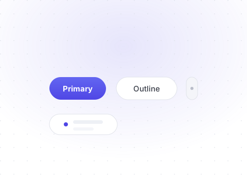
Buttons, menus, and everything a user can trigger.
Button
Triggers an action or event.
Button Group
Joins related buttons into one control.
Action Menu
A compact menu of contextual actions.
Dropdown Menu
A menu that drops down from a trigger.
Context Menu
A menu that appears on right-click.
Menu Bar
A horizontal bar of dropdown menus.
Toolbar
Groups related controls in a row.
Toggle
A two-state pressable control.
Toggle Group
A set of mutually exclusive toggles.
Badge
A small label for status or counts.
Kbd
Displays keyboard shortcuts.
Alert
Inline feedback with a status tone.
Forms
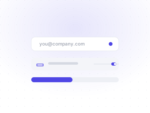
Inputs, pickers, and form controls.
Input
Collects short free-form text.
Password Input
Input with show and hide visibility.
Search Input
Input with search affordances.
Textarea
Multi-line text entry.
Label
Accessible caption for controls.
Field
Label, control, and validation wrapper.
Select
Pick one option from a list.
Combobox
Search and pick from options.
Checkbox
Select one or many options.
Checkbox Group
A group of checkboxes.
Radio Group
Choose exactly one option.
Switch
Toggles a binary setting.
Slider
Pick a value from a range.
Number Field
Stepper-controlled numeric input.
OTP Field
One-time password entry.
File Input
Upload files via drag and drop.
Date Picker
Pick a single date.
Date Range Picker
Pick a start and end date.
Time Field
Pick a time of day.
Rating
Rate on a star scale.

Data Display
Tables, avatars, and content containers.
Card
A flexible content container.
Table
Structured rows and columns.
Data Table
Sortable, interactive tables.
Stat Card
A headline number with context.
Avatar
Represents a person or entity.
Avatar Group
Stacked overlapping avatars.
Progress
Shows task completion.
Progress Steps
Guides through a sequence.
Skeleton
Loading placeholders.
Separator
Divides content groups.
Accordion
Collapsible content sections.
Timeline
A vertical sequence of events.
Image
Responsive images with aspect ratio.
Video
Embedded media player.
Inline Code
Code within prose.
Code Block
Standalone code snippets.
Metric
A labeled value with trend.
Overlay
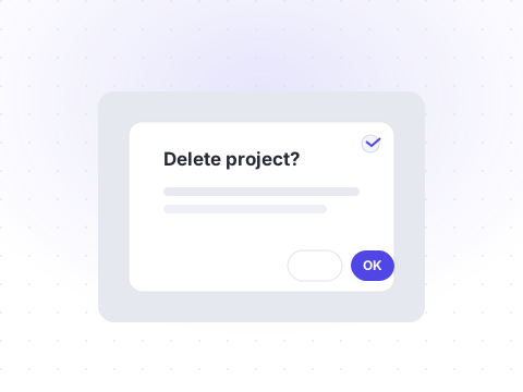
Modals, tooltips, and floating layers.
Dialog
A focused modal window.
Alert Dialog
A modal that requires confirmation.
Sheet
A slide-in panel from the edge.
Drawer
A bottom-anchored modal panel.
Popover
Floating content anchored to an element.
Tooltip
Short contextual hint on hover.
Hover Card
Rich content preview on hover.
Preview Card
A preview surfaced on hover.
Collapsible
Expand and collapse content.
Toast
Transient notifications.
Lightbox
Full-screen image viewer.
Scroll Area
Custom scrollable container.

Navigation
Menus, sidebars, and page navigation.
Tabs
Switch between related panels.
Breadcrumb
Shows the current page path.
Navigation Menu
Responsive site navigation.
Sidebar
Collapsible app navigation.
Command
A searchable command palette.
Pagination
Page through long lists.
Stepper
Steps through a process.
Link
A styled text link.
Dock
A macOS-style icon launcher.
Marquee
An infinite scrolling strip.
Scroll Progress
Reading progress indicator.
Table of Contents
In-page table of contents.
Charts
Visualize data with accessible SVG charts.
Feedback
Loading, empty, and error states.

Layout
Primitives for structuring the page.

Utility
Low-level primitives every component builds on.
Ready to build something beautiful?
Spin up the playground, or copy your first component and ship it in minutes.