Badge
StatusA small label that highlights status, counts, or categories.
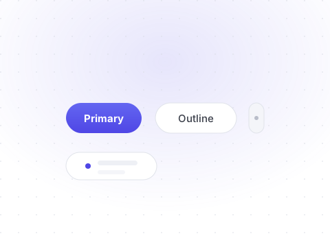
npx shadcn@latest add badgeVariants
Use variants to signal meaning at a glance.
Preview
LiveDefaultSecondaryOutlineDestructiveGhostLink
tsx
1<Badge>Default</Badge>2<Badge variant="secondary">Secondary</Badge>3<Badge variant="outline">Outline</Badge>4<Badge variant="destructive">Destructive</Badge>5<Badge variant="ghost">Ghost</Badge>6<Badge variant="link">Link</Badge>
With icons
Badges can carry icons and are often used for statuses or counts.
Preview
LiveLive24 newOffline
tsx
1<Badge>2 <span className="size-1.5 rounded-full bg-emerald-400" />3 Live4</Badge>5<Badge variant="secondary">24 new</Badge>6<Badge variant="destructive">Offline</Badge>
API reference
All props of the underlying Base UI primitive are forwarded. The table below documents the Shelf-specific props.
| Prop | Type | Description |
|---|---|---|
| variant | "default" | "secondary" | "destructive" | "outline" | "ghost" | "link"= "default" | The visual style of the badge. |
| render | React.ElementType | Render as a different element, such as an anchor. |