Input
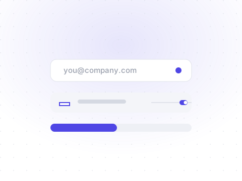
FormCollects short, single-line text from the user.
npx shadcn@latest add inputDefault
Preview
Livetsx
1<Input type="email" placeholder="you@company.com" />2<Input placeholder="Search…" />
States
Disabled inputs are non-interactive and dimmed; invalid ones get a destructive ring.
Preview
Livetsx
1<Input placeholder="Disabled input" disabled />2<Input placeholder="Invalid value" aria-invalid />
API reference
All props of the underlying Base UI primitive are forwarded. The table below documents the Shelf-specific props.
| Prop | Type | Description |
|---|---|---|
| type | string= "text" | The input type attribute. |