Getting started
Ship your first component in minutes
Shelf works with any Tailwind CSS v4 setup. No config, no wrappers — just install and import.
React 19+Tailwind CSS v4Node.js 20+

1
Install the package
Add Shelf to your project with a single command.
terminal
bash
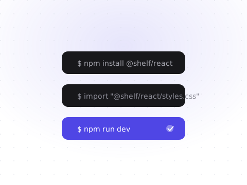
1npm install @shelf/react
2
Add the CSS variables
Shelf ships a single stylesheet with design tokens for light and dark themes.
app/layout.tsx
tsx
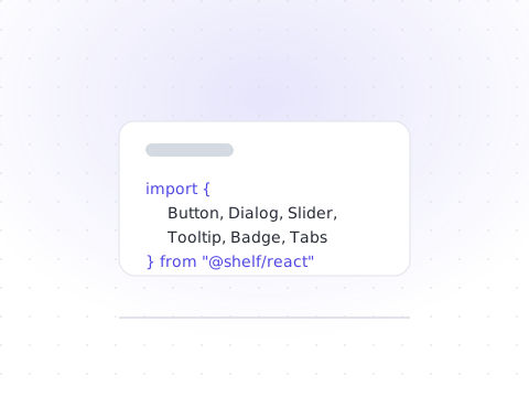
1import "@shelf/react/styles.css"
3
Import a component
Components are tree-shakeable, so you only ship what you use.
app/page.tsx
tsx
1import { Button } from "@shelf/react"23export function App() {4 return <Button>Hello, Shelf</Button>5}

Theming
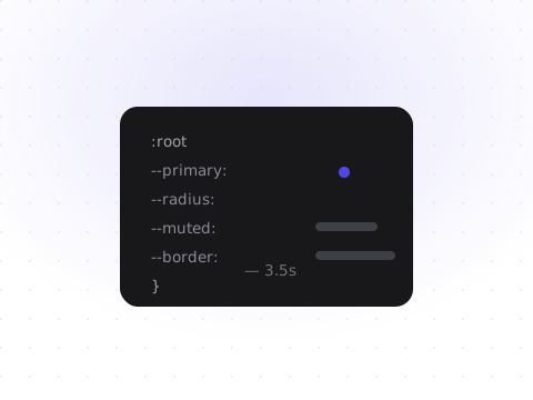
All colors are exposed as CSS variables, so rebranding Shelf is a matter of overriding a handful of tokens. Toggle the .dark class on the root element to switch themes at runtime.
globals.css
css
1:root {2 --background: oklch(0.985 0.003 247.858);3 --primary: oklch(0.546 0.245 262.881);4 --ring: oklch(0.707 0.145 262.881);5}67.dark {8 --background: oklch(0.18 0.015 259);9 --primary: oklch(0.645 0.2 262.881);10}
Accessibility
Every component is built on Base UI, which provides full keyboard support, focus management, and ARIA attributes out of the box. Dialogs trap focus, selects support type-ahead, and toggles announce their state to screen readers.