Alert Dialog
OverlayA modal dialog that interrupts the user and requires acknowledgement.
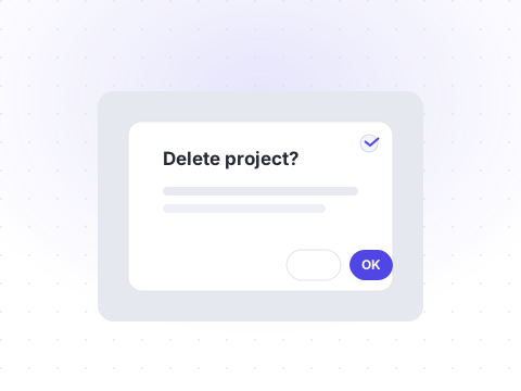
Alert dialogs are used for high-consequence actions. Shelf's implementation is built on the Base UI Alert Dialog primitive, which manages focus, Escape, and role semantics for you.
npx shadcn@latest add alert-dialogBasic alert dialog
A title, description, and two actions: cancel and confirm.
Preview
Livetsx
1<AlertDialog>2 <AlertDialogTrigger render={<Button variant="outline">Delete account</Button>} />3 <AlertDialogPortal>4 <AlertDialogBackdrop />5 <AlertDialogPopup>6 <AlertDialogTitle>Delete this account?</AlertDialogTitle>7 <AlertDialogDescription>8 This action cannot be undone.9 </AlertDialogDescription>10 <div className="flex justify-end gap-2">11 <AlertDialogCancel>Cancel</AlertDialogCancel>12 <AlertDialogConfirm>Delete</AlertDialogConfirm>13 </div>14 </AlertDialogPopup>15 </AlertDialogPortal>16</AlertDialog>
Keyboard and focus
The dialog traps focus while open, closes on Escape, and returns focus to the trigger.
Preview
Livetsx
1<AlertDialog>2 <AlertDialogTrigger render={<Button variant="outline">Delete account</Button>} />3 <AlertDialogPortal>4 <AlertDialogBackdrop />5 <AlertDialogPopup>6 <AlertDialogTitle>Delete this account?</AlertDialogTitle>7 <AlertDialogDescription>This action cannot be undone.</AlertDialogDescription>8 <div className="flex justify-end gap-2">9 <AlertDialogCancel>Cancel</AlertDialogCancel>10 <AlertDialogConfirm>Delete</AlertDialogConfirm>11 </div>12 </AlertDialogPopup>13 </AlertDialogPortal>14</AlertDialog>
API reference
All props of the underlying Base UI primitive are forwarded. The table below documents the Shelf-specific props.
| Prop | Type | Description |
|---|---|---|
| open | boolean= false | Controlled open state of the dialog. |
| onOpenChange | (open, eventDetails) => void | Called when the dialog opens or closes. |
| defaultOpen | boolean= false | Whether the dialog is initially open. |
| modal | boolean= true | Blocks interaction with the rest of the page while open. |