Dialog
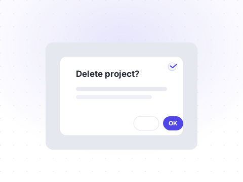
OverlayA modal window that requires attention and blocks interaction with the rest of the page.
npx shadcn@latest add dialogDefault
Preview
Livetsx
1<Dialog>2 <DialogTrigger render={<Button>Open dialog</Button>} />3 <DialogPortal>4 <DialogBackdrop />5 <DialogPopup>6 <DialogTitle>Delete workspace?</DialogTitle>7 <DialogDescription>8 This will permanently remove the workspace and all of its projects.9 </DialogDescription>10 <DialogCloseButton />11 <div className="mt-2 flex justify-end gap-2">12 <DialogTrigger render={<Button variant="outline">Cancel</Button>} />13 <Button variant="destructive">Delete</Button>14 </div>15 </DialogPopup>16 </DialogPortal>17</Dialog>
API reference
All props of the underlying Base UI primitive are forwarded. The table below documents the Shelf-specific props.
| Prop | Type | Description |
|---|---|---|
| open | boolean | Controlled open state. |
| onOpenChange | (open: boolean) => void | Called when the dialog opens or closes. |
| modal | boolean= true | Whether the dialog blocks interaction with the page behind it. |