Toggle
ActionsA two-state button that can be on or off.
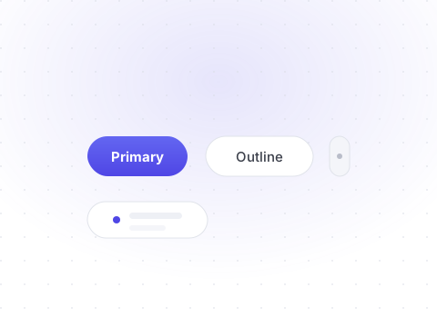
Toggles are useful for on/off actions like bold, favorite, or follow. The active state is driven by the Base UI data-pressed attribute, which styles it with the primary palette.
npx shadcn@latest add toggleStates
Pressed, unpressed, and disabled toggles.
Preview
Livetsx
1<Toggle defaultPressed aria-label="Toggle bold">2 <Bold />3</Toggle>45<Toggle aria-label="Toggle italic">6 <Italic />7</Toggle>89<Toggle disabled aria-label="Toggle underline">10 <Underline />11</Toggle>
With icons
Use toggles for favorite, notify, and enhance actions.
Preview
Livetsx
1<Toggle defaultPressed aria-label="Toggle bold">2 <Bold />3</Toggle>45<Toggle aria-label="Favorite">6 <Star />7</Toggle>89<Toggle aria-label="Notifications">10 <Bell />11</Toggle>1213<Toggle aria-label="Enhance">14 <Sparkles />15</Toggle>
API reference
All props of the underlying Base UI primitive are forwarded. The table below documents the Shelf-specific props.
| Prop | Type | Description |
|---|---|---|
| defaultPressed | boolean= false | Whether the toggle starts pressed (uncontrolled). |
| pressed | boolean | Controlled pressed state. Pairs with onPressedChange. |
| onPressedChange | (pressed: boolean) => void | Called with the new state whenever the toggle changes. |
| disabled | boolean= false | Whether the toggle ignores user interaction. |
| value | string | A unique value used when the toggle sits inside a ToggleGroup. |