Button
InteractiveTriggers an action or event, such as submitting a form or opening a dialog.
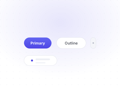
Buttons are the workhorse of any interface. Shelf buttons are built on the Base UI Button primitive, so focus management and keyboard behavior come free.
npx shadcn@latest add buttonVariants
Six visual variants cover everything from primary actions to destructive ones.
Preview
Livetsx
1<Button>Default</Button>2<Button variant="secondary">Secondary</Button>3<Button variant="outline">Outline</Button>4<Button variant="ghost">Ghost</Button>5<Button variant="destructive">Destructive</Button>6<Button variant="link">Link</Button>
Sizes
Three text sizes plus three icon sizes.
Preview
Livetsx
1<Button size="xs">Extra small</Button>2<Button size="sm">Small</Button>3<Button>Default</Button>4<Button size="lg">Large</Button>
Disabled & loading
Buttons can be disabled or given a spinner state while work is in flight.
Preview
Livetsx
1<Button disabled>Disabled</Button>2<Button disabled variant="outline">Disabled outline</Button>34<Button aria-busy="true">5 <span className="size-4 animate-spin rounded-full border-2 border-current border-t-transparent" />6 Saving…7</Button>
API reference
All props of the underlying Base UI primitive are forwarded. The table below documents the Shelf-specific props.
| Prop | Type | Description |
|---|---|---|
| variant | "default" | "outline" | "secondary" | "ghost" | "destructive" | "link"= "default" | The visual style of the button. |
| size | "default" | "xs" | "sm" | "lg" | "icon" | "icon-sm" | "icon-lg"= "default" | Controls the button height and padding. |
| render | React.ElementType | Render as a different element, such as a link. |